Forget everything you think you know about wedding colors. For years, the conversation has been dominated by soft, airy pastels. But for 2027, the script is flipping. The single most popular wedding color for 2027 isn’t a color at all: it’s a direction: saturation. Couples are moving away from muted tones and embracing deep, rich, and intensely personal palettes. We’re seeing a definitive split, with half of couples opting for moody, earthy tones and the other half choosing vibrant, almost electric hues. This isn’t about chasing a fleeting trend; it’s about creating an immersive, memorable atmosphere.
The Great Divide: Moody Earth Tones vs. Electric Brights
For years, blush and sage green were the undisputed champions of the wedding world. They are safe, pretty, and easy to work with. But safety is no longer the primary goal. One planner I spoke with said, “it’s all over the map.” This split is the real story for 2027. On one side, you have palettes built around chocolate brown, terracotta, and deep forest greens, creating a feeling of grounded, organic luxury. These aren’t the rustic browns of a barn wedding; think the rich, polished brown of a bespoke leather armchair. A recent analysis from WeddingPro confirms this shift toward more expressive and unconventional color choices, moving beyond traditional pastels.
On the other end of the spectrum is a riot of color. We’re talking chartreuse, cobalt blue, and magenta. These aren’t just accent colors anymore; they are the main event. This trend, known as “color drenching,” involves using a single, bold color across multiple elements, from stationery to linens and even lighting. It’s a confident, high-fashion approach that makes a serious statement. It shows a couple’s personality in a way that beige simply cannot.
The most telling thing about 2027 wedding color palettes isn’t a single shade. It’s that the field has split… half of them described something quiet and earthy while the other half described chartreuse.
Silver’s Comeback and the New Neutrals
For the last decade, gold and rose gold have been the go-to metallic accents. In 2027, silver is making a decisive comeback. Its cool, crisp feel pairs beautifully with both the moody jewel tones and the electric brights that are trending. A Midnight Blue & Silver palette feels modern, chic, and impossibly elegant, as noted by trend-watchers at trend-watchers at wedding decor. Think silver charger plates on a deep blue tablecloth or invitations with silver foil on navy cardstock.
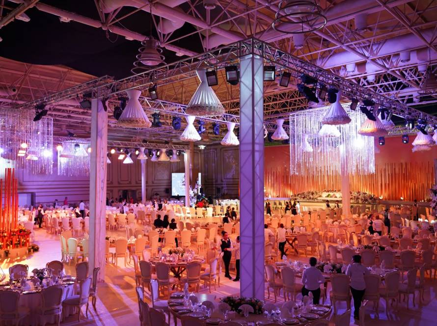
Neutrals are also getting a makeover. The beige and ivory of the past are being replaced with warmer, more complex shades. Think Espresso Neutral palettes featuring warm creams, sand, and deep, rich browns. These aren’t just background colors; they create a sophisticated, layered look that feels both timeless and modern. At Regal Castle Event Center, we’ve seen how a venue’s architecture can support these palettes. The right space doesn’t fight your colors; it enhances them. Our flexible vendor policies also mean you can bring in the exact floral and decor artists who specialize in these nuanced color stories.
Building Your 2027 Palette: Anchor, Complement, Accent
Choosing a bold color direction doesn’t mean your wedding will look like a paint factory exploded. The key is a balanced palette with three distinct roles: an anchor, a complement, and an accent.
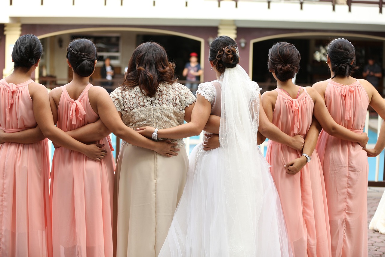
- Anchor Color: This is your dominant shade, the one that sets the mood. For 2027, this might be a deep Chocolate Brown or a vibrant Cobalt Blue. It will feature on the biggest visual elements, like bridesmaid dresses or table linens.
- Complementary Color: This shade is used to provide contrast and visual interest. For a Chocolate Brown anchor, a soft Ivory or warm cream works perfectly. For Cobalt Blue, a crisp white or even a sunny yellow could be the complement.
- Accent Color: This is where you have fun. It’s a pop of color used sparingly to draw the eye. For a brown and ivory palette, this could be a muted rust or a pop of greenery. For the cobalt palette, a metallic silver or a touch of hot pink provides that memorable flair. As we provide event planning assistance, we often help couples map these choices to specific elements, ensuring the vision is cohesive from the invitations to the getaway car.
Integrating Nigerian Culture into Your 2027 Wedding Colors
In Lagos, a wedding is a vibrant celebration of family, tradition, and personal style. Your color palette is a powerful way to tell this story. While global trends point towards moody tones and brights, Nigerian weddings have always embraced bold color. We’re not just adopting a trend; we’re leading it.
Instead of just picking “blue,” consider the specific shades in traditional Aso Ebi fabrics. The deep indigos and royal blues found in Adire textiles can become a stunning anchor for a modern palette, paired with silver accents and white florals. For a warmer palette, look to the rich, earthy reds and browns of Aso Oke. These can be modernized with cream, gold, and lots of lush greenery, a key element highlighted for 2027. Weaving these culturally significant colors into a contemporary framework creates a look that is both personal and deeply resonant. With our capacity for 500-1000 guests, we have seen how these vibrant color choices can transform a large space into an intimate, celebratory hall.
Don’t just pick a color from a magazine. Look at the fabrics of your family’s history. The richest palettes for a Nigerian wedding are often found in the patterns of Aso Ebi and the earthy tones of traditional crafts.
Beyond the Palette: Color Psychology and Budget
Your color choice does more than just look pretty; it sets an emotional tone. Deep blues and greens create a sense of calm, elegance, and serenity. Bright, electric colors like magenta and chartreuse evoke energy, joy, and excitement. Browns and terracottas feel grounding, warm, and stable. According to the principles of color psychology, these choices subconsciously influence how your guests feel throughout the event. Research into color psychology shows how shades like blue can be calming, while energetic colors like yellow can feel more optimistic.
Achieving a high-end look doesn’t require an unlimited budget. The key is strategic application. You can create a rich, moody atmosphere with deep-colored linens and dramatic lighting, which often costs less than elaborate floral arrangements in every corner. Use your boldest, most expensive color for high-impact items like the bridal party’s attire or the entrance decor. Use more affordable complementary colors and greenery to fill out the rest of the space. This approach delivers a designer look without the associated price tag in Naira.
FAQ
What are the most popular wedding colors for 2027?
For 2027, there isn’t one single popular color but rather two dominant trends: deep, moody, and earthy palettes (like chocolate brown, espresso, and forest green) and vibrant, electric “color drenching” palettes (like cobalt blue, chartreuse, and magenta). Silver is also replacing gold as the primary metallic accent.
How do I choose a wedding color palette?
Start by considering your venue and the season. A grand, elegant hall like Regal Castle can handle dramatic, moody colors, while a garden wedding might call for more natural tones. Most importantly, choose colors that reflect your personal style as a couple. Don’t just follow a trend; pick shades that you genuinely love and that tell your story.
What is “color drenching”?
Color drenching is a design trend where a single, bold color is used extensively across many different elements of the wedding decor. Instead of using a color as just an accent, you would see it on the linens, the flowers, the lighting, and even the stationery to create a powerful, immersive, and high-fashion statement.
How can I make my wedding colors eco-friendly?
To make your palette more sustainable, prioritize locally sourced flowers to reduce your carbon footprint. You can also incorporate natural, undyed fabrics like linen or cotton for your tablescapes. For decor, consider using potted plants or herbs that can be replanted after the event instead of cut flowers.
How do I incorporate Nigerian traditions into a modern color palette?
Look to traditional fabrics like Aso Ebi and Aso Oke for inspiration. The rich jewel tones, intricate patterns, and earthy dyes can be the foundation of your palette. For example, use the deep blue from an Adire cloth as your anchor color, and pair it with modern accents like silver and lush greenery for a look that is both culturally significant and stylish.
How much should I budget for wedding decor in Nigeria?
Costs for wedding decor in Lagos can vary dramatically from a few hundred thousand Naira to several million, depending on the scale and complexity. A good strategy is to allocate your budget to high-impact areas. Spend more on dramatic lighting and luxurious linens, which can transform a space, and be more frugal with smaller details. Always get detailed quotes from at least three different decorators.
Choosing your wedding colors for 2027 is an opportunity to make a bold statement. Whether you lean into the moody and romantic or the bright and electric, the goal is to create an experience that feels authentic to you. These palettes are more than just a backdrop; they are a core part of your wedding’s story. If you’re ready to plan a celebration that is as unique as your love, contact us on 09165021815 let’s talk about how our space can bring your vision to life.